Creating my first WP7 application.
Published on Oct 20, 2010A few weeks ago I decided to go ahead and try to create my first WP7 application. Not sure why I wait so long, but I think that the official launch had something to do with my newly found entusiasm.
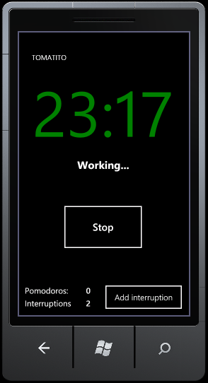
Tomatito, a Pomodoro timer for your phone.
I recently posted about using Pomodoro to track my time so I decided that my first app should be a Pomodoro timer for the phone. It’s a fairly simple thing to do and useful at the same time.
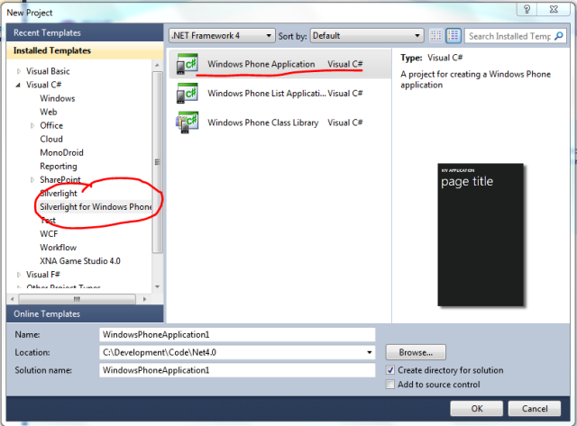
So (after downloading and installing the SDK) I fired up VS 2010 and from the Silverlight templates I selected the Silverlight phone application template.

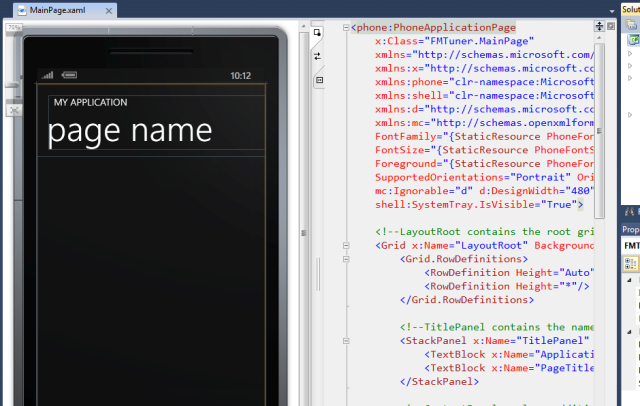
The default view gives you a vertical split pane with the xaml and designer view.
Looks odd for a second until you realize that is genious. The vertical split allows you to see the whole phone screen.

From that point on, you just start cranking code.
Being this my first application I broke one of my rules and I made no attempts to write SOLID code or any testing whatsoever and just play around and explore the API.
After less than 2 hours I pretty much had a simple version working. Most of those 2 hours were expend on Google or pocking around the different namespaces related to the phone.

My experience with Silverlight is tangensial. Let me elaborate. I did some programming in the last year and a half, but mostly was library code. My Xaml FU is nowhere near where it needs to be. That was clear while I tried to change the background colour of a button programatically.
It was an incredible frustrating exercise of coding, debugging the code and still being clueless. After “a lot” of searching and visiting the obscure corners of the internet (aka: bad forums), I found the answer.
Apparently you need to use a content template to be able to change that property during runtime. Of course this is not a problem of WP7, just my lack of familiarity with XAML.
Design guidelines.
I’m not an IPhone guy (I own an Android), but one of the things nobody can really deny is that the user experience is, in general, better than the Android.
Microsoft came up with the “Metro” UI/theme for the phone and they have done a good job talking about it and given lots of guidelines. In the app hub site they published a free electronic book in pdf with lots of details of what is the expected experience from a user point of view.
After reading the guidelines I changed a lot of things even in my simple app. For once, I’m not changing the colour of the buttons anymore and using the provided styles to maintain consistency.
I think that having this guidelines in place is what can help to make this phone and their apps a success. We need to remember that sadly most developers, myself included, have a hard time designing nice looking user interfaces. Even when we can recognize one, we still have a hard time coming up with it.
Manual testing and debugging
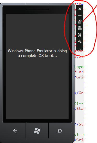
The first time you click F5 the emulator will launch and do a complete OS boot up. It takes a few seconds and them the app gets deployed. After this first time you don’t need to close the emulator, just stop the running app, do you changes and hit F5 again. The app will be up and running in the emulator in no time.
To interact with the phone you use your mouse or the controllers in the top right corner.

This controllers allow you to turn the phone to one side or the other to check how your application look in those orientations. There is an API to detect the orientation of the screen but I haven’t play with it.
Setting break points in the code and everything else works exactly as you could expect with any other application. I really never notice that I was writting a phone application but just a silverlight app with very well defined UI constrains.
Conclusion.
I’m very exited about all the posibilities and how easy create an application really is.