Beautiful new typography, the work of Pablo Impallari.
Published on Apr 21, 2013I really enjoy nice typography and this interest make me explore some of the several font providers out there. Sometimes for inspiration and other times is just like visiting an art gallery.
I try to keep track of new fonts that I like and I noticed that a few of the fonts I favored have been created by the same typographer.
This on it’s own is not that surprising, I obviously like his style, so is perfectly understandable I like several of his fonts.
The typographer is Pablo Impallari and I will show some of my favorite fonts.
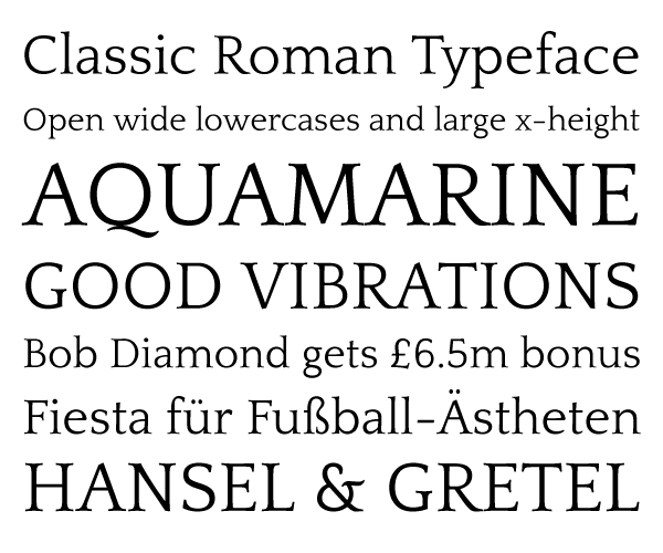
Quattrocento
I like it so much that I use Quattrocento for all the content in this blog (except headers, navigation and cut outs where I choose Gentium Book Basic).
It’s a classy font with a vintage feel without sacrificing readability.
I like the Roman version better than the Sans but of course there is a place for both.
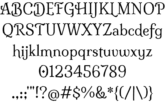
Milonga
I already mentioned this one in a previous post a few days ago.
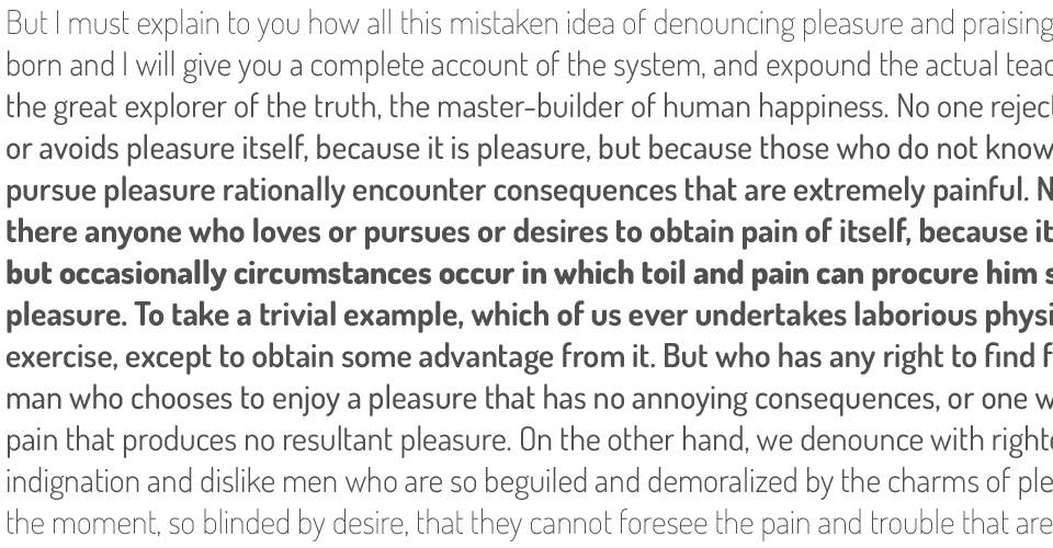
Dosis, elegant sans-serif
This one come in seven different weights and include a few alternates.
I really like the light and medium weights due to the minimalistic design without losing personality.
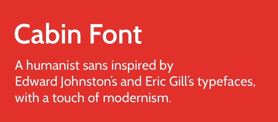
Cabin, where the lower case q, e, r, and m make an impression.
A very nice and balance sans. I particularly like the personality in some of the lower case letters.
The stem and termination for the r is fairly unique, as well as the termination of the letter e.
Lobster, a new classic
I leave this one for the end of the post since I’m pretty sure you saw it.
It have been used a lot latelly, specially in the start-up community (Codeacademy, Bayanumba, Camera tag and others).
It’s a very elegant and playful font, probably victim of it’s own success. It have been used so much that I would stay away from it at least for a little while. The font has such personality that jump at you (in a good way).
Check the site to learn more about the process and the inspiration behind it.


